The wireframe final!
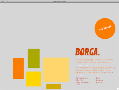
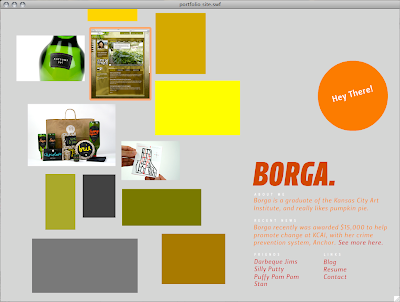
What you see when you first go to the site:
The image collage on the left is a big ol' scroll, and when you see a thumbnail you like, you can click on it, annnd...
it opens to a huge image of it. (I still want to implement a slideshow element here, to show multiple views, etc... but time is always an issue. It's happening over winter break!)
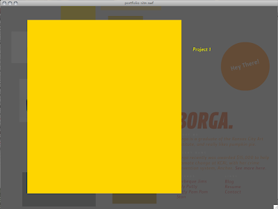
You can click anywhere on the screen to close the big image out, and then you can click on any of the text links, like the "see more here" text
and it will take you somewhere special.

"also provide a written description of your intentions for the site -- what you hoped to achieve in its design, rationale for the design decisions you made, what you learned through this process, what you are most proud of, what you struggled most with."
What I hoped I would achieve in it's design:
My main issue was usability. I wanted a website where the user didn't have to learn something new, where they could just see all the information they need right when they get to the site, in a somewhat engaging way, and it was easy to see large detail shots of every work. I think I accomplished these things!
Rational for the design decisions I made:
Well, we weren't supposed to design it at this point... so......... umm. The layout? I wanted it easy to understand, but not the traditional name in the top left hand corner, and content below. I mixed it up a little, and I have a scroll that looks like a loosely gridded collage of my work to show that I'm pretty lighthearted about design... not too serious!
What I learned through the process:
That I actually am capable of staying afloat in Flash!! This was the first time that I actually understood what I was doing, and I did most of it on my own. I was so proud of myself!
What I am most proud of:
see above.
What I struggled with the most:
Not designing it yet. I always always always start with a concept first, then move into design, then into implementation, which is the way all designers operate, right? So it was extremely weird for me and hard to come up with something, when I don't even have a concept to ground it in, or a design to frame it with. It's going to be weird skinning it with something next semester, and I feel like I'll end up having to change the entire layout and everything. But! It was a good experience.


