The wireframe final!
What you see when you first go to the site:
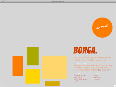
The image collage on the left is a big ol' scroll, and when you see a thumbnail you like, you can click on it, annnd...
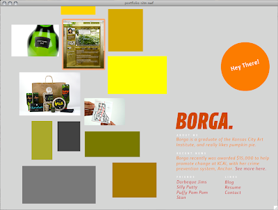

it opens to a huge image of it. (I still want to implement a slideshow element here, to show multiple views, etc... but time is always an issue. It's happening over winter break!)
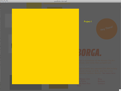

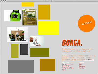
You can click anywhere on the screen to close the big image out, and then you can click on any of the text links, like the "see more here" text

"also provide a written description of your intentions for the site -- what you hoped to achieve in its design, rationale for the design decisions you made, what you learned through this process, what you are most proud of, what you struggled most with."
What I hoped I would achieve in it's design:
My main issue was usability. I wanted a website where the user didn't have to learn something new, where they could just see all the information they need right when they get to the site, in a somewhat engaging way, and it was easy to see large detail shots of every work. I think I accomplished these things!
Rational for the design decisions I made:
Well, we weren't supposed to design it at this point... so......... umm. The layout? I wanted it easy to understand, but not the traditional name in the top left hand corner, and content below. I mixed it up a little, and I have a scroll that looks like a loosely gridded collage of my work to show that I'm pretty lighthearted about design... not too serious!
What I learned through the process:
That I actually am capable of staying afloat in Flash!! This was the first time that I actually understood what I was doing, and I did most of it on my own. I was so proud of myself!
What I am most proud of:
see above.
What I struggled with the most:
Not designing it yet. I always always always start with a concept first, then move into design, then into implementation, which is the way all designers operate, right? So it was extremely weird for me and hard to come up with something, when I don't even have a concept to ground it in, or a design to frame it with. It's going to be weird skinning it with something next semester, and I feel like I'll end up having to change the entire layout and everything. But! It was a good experience.


2 comments:
What I first like about the site is combination and composition of typography and image. It seems to have a very nice balance. I was curious to the "hey there" image but am let down that it doesn't function. After that I became very interested in the movement caused by the mouse. I was a little unaware of it and it seemed a bit sensitive. I would definitely keep the scrolling activated only inside the window or else it goes crazy and I tend to get lost. I also think that when you click on a project the scroll should be deactivated. after I'm done looking at it, its hard to find my place in the gallery. For this reason I think it is hard to navigate through the site gallery even though it seems very logical. I wonder if a snapping scroll would be helpful to keep you attached to a certain part of the page.Viewing Images in the gallery is nice with the grey background and maybe there could be a next and back bar to walk you through the images in the background so you can use that movement to your advantage.
I like how you can get a fast visual example of your body of work and tells me you like to expose your projects a lot. I was wondering if there would be more about you as an individual other than a sentence and how would this be inquired.
One thing that irritates me besides the sensitive scrolling is how projects are organized. I can't find any logical order. Even going from top to bottom the project numbers are a bit out or order. Is there any reason to have such a random collection?
I think it is interesting how you give a warm welcome and place your information directly up front on the website along side your work. It helps to reinforces the idea that I have done this and these are my abilities and what i am doing now. The idea of showing people recent news is wonderful it makes a person feel that they are a part of what you are doing/ or that you care to let them know what you are working on. When you are scrolling through the work it would have been nice to see that the work stopped at the end so you new that it wouldn't go any further or that it keeps going into the vast space of no where. An idea with the images is what was stated in class is showing a down state of the images after they have been clicked on, this is because with in your work a person can get lost because you have so many items in various places. I like the fact when you click to bring up an image the image is big and easy to see and understand. Also, makes it easy to exit and get used to that concept. One part that I'm curious about is are you going to have multiple views of your images? If so how are you going to represent these? are they going to be with in the scroll showing different view you can click on individually? or are they going to be with in the large image giving options of smaller thumbnails to click on within? I think its good how you have thought about giving the background a dark color when the larger image comes up to gain a focus to what we the viewers are looking at. Have you thought about taking the Hey There! and using it as a restart to the navigation because i know the intention is to scroll but you have so much it would be nice to just click and go back to the beginning.
Create a frame perhaps that is sitting on the HTML that has a drop shadow like the side is slipping between the top and bottom of the HTML file that it is being contained within. *Brought to you by your friend, Tyler Galloway!
Post a Comment