30 March 2008

INFORMATION GRAPHIC INITIAL RESEARCH

In this initial stage of research for project 3, I had a really difficult time getting started on anything... there was nothing I could find as far as "real" information goes for my topic. And beyond that, I had the job of tying together objects from a grandmother's home with the theme of "last will", and having it work with the infographic requirements. So I decided to work on my infographic research and finding my type class article hand-in-hand, since that way, I wouldn't be completely lost or stuck moving on to one or the other. I researched ideas in regards to the cost of each item, or the materials that they were made out of, but it was all waaay too stale or boring to go anywhere with without falling asleep. I wanted something that would compliment old people stuff in a good way... not make it more boring than it already is.

I came up with how these items came about, as in where and when... and found some interesting bits of information, so I decided that this may be a good route. So then I focused on the article I needed for type class, and started investigating topics on actual last wills, or statistics on deaths in the elderly, and moved on to assisted elderly suicide...... and it made me depressed. Not only because of the subject matter, but because there was no way I could tie an article about 'old people feeling so terrible about themselves that they want to end their life' and 'the country of origin of objects from their home' together nicely. So I brainstormed, and came up with a breakthrough idea of making the article more about antiques and where they generally come from.

Antiques or thrift generally come from people who have passed away, so I thought that was a great juxtaposition of a micro and macro view of my objects, and also fitting in with my title for my set. It works with my infographic research since I'm looking at where the objects come from on a larger scale (country and time period), and the article looks at where objects come from on a smaller scale (tag sales from old lady deaths). But finding an article that will fit my requirements may be a feat... we'll see!

Paula Scher Typography Poster

25 March 2008

FINAL ICON PRESENTATION


final icon set title


final connotations list


final color palette


final color set at 1 inch


final black and white set at 1 inch


final bundt pan icon


final cigarettes icon


final cuckoo clock icon


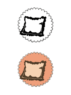
final pillow icon


final teacup icon


final television icon

23 March 2008

REVISED TITLE IDEAS


Focusing more on just the aspects of a grandma and her home, I've refined my list of title ideas, dropping some names and adding others. Let's see how these go...

Antiqued Housewares
Wrinkles & Liver Spots
Wrinkled Antiques
Artifacts of A Last Breath
Gathering Dust
Aching & Decaying
Vintage Ruffles & Lace
Fading Floral Wallpaper
Sag & Shake (OR Saggy & Shaky)...
Home From A Wild Bingo Night
(Or simplified to Home From Bingo Night)
Reminiscing on Doilies
Fragile Home
Fossilized Home
Domestic Fading Memories
Shady Old Lady

This was my original pool of gathered adjectives and other words to be used as ideas in my icon set title:

senile, feeble, ancient, aged, antiquated, battered, creaky, fragile, frail, shabby, shaking, threadbare, tired, weak, confined, handicapped, powerless, silenced, archaic, big-yawn, common, dead, worn out, elderly, exhausted, fossil, geriatric, seasoned, delicate, faint, frail, rotten, tender, wobbly, wistful, melancholy, nostalgic, reflective, funereal, grim, droopy, like yesterday, lonesome, reflecting, reflective, withdrawn, bitter, decaying, disintegrating, ebbing, fading, vanishing, withering, eternal rest, decay, expiration, lights out, quaint, knit & purl, shady old lady, dignity, neglect, abandonment, pleasant, smudged, dementia

22 March 2008

COLORS CONTINUED...


Based on comments from the previous post, I tried out these color combinations- and I think I like them the best so far. I think they have a more off-kilter personality than my first more colorful set, and I like that. I'm just trying to decide now which version I like better- the green or the pink....

19 March 2008

MORE COLOR APPLICATIONS

This post is to go along with an earlier post, dated 3.12.

My idea in this color application was to simplify my palette, and to go with a more neutral color scheme, focusing more on the actual object. I thought that the yellow would really come forward against the brown. I was also thinking more conceptually, thinking that these colors reference dirty smoke from cigarettes, or dark brown furniture, and yellowing wallpaper, which would come with living in a home for an extended time.

Originally, with this application, I was using a light and medium yellow on my objects, which added more dimension to them... but then I realized I was working with a four-color palette...
So I simplified.


TITLE IDEAS

yellowing wallpaper in an old woman's house?

Something memorable, something embodying the essence and theme behind my icon set.
Here are some initial ideas:

Wrinkles & Liver Spots
Threadbare Agnes
Homespun Eternal Rest
Moth-Eaten Doilies
Lights Out, Oma (Oma is a german term for grandma, I believe)
Lights Out on Oma (Or Agnes?)
Quietly Isolated
Aching & Decaying
Bitter Lace
A Quaint Pre-Funeral
Confined to Knit & Purl
Vanishing Ruffles & Lace
Vintage Ruffles & Lace
4-Inch-Thick Bifocals
Covered In Cat Hair
Reflecting on Fruit Cake
Fading Floral Wallpaper
Home From A Wild Bingo Night
Hot Rollers in Fading Blue Hair

This was the wild bingo night?


Let me know what you think of my ideas

12 March 2008

ADJUSTED COLOR PALETTE, THREE-COLOR DESIGN

This is the most recent color set of my icons- I completely re-vamped my color palette from spread 1, so it is based completely off of one 1" square of the spread, with four colors being pulled out and used from it. Also, my icons have progressed to a three-color scheme per icon, giving much more dimension than what the two-color option offered.


BEGINNING ICON COLOR REFINEMENTS

Progress in color application to all my icons in the set


INITIAL COLOR APPLICATIONS

Color applications on just one preliminary icon- each set corresponding to one color palette (posted earlier). The left side of each grouping would be some of the most successful color combination possibilities, and the right side being possible applications of those combinations to my icon.


10 March 2008

STEFAN SAGMEISTER LECTURE RESPONSE

click to enlarge
(From Stefan's lecture at the Unity Temple on the Plaza)


08 March 2008

FINAL ICON SET

Border inspiration- doily shape


05 March 2008

ICON COLOR PALETTE SETS


Images of amazing grandma color schemes! Some inspiration came from these...


The following swatch sets are gathered and expanded from my 'Agnes' semiotic scrapbook, with the actual clipped image from each spread on the top of each set of three colors, and it's main color drawn from it directly below. The colors on the left and right sides are variants of value and saturation from the center. I tried to find colors within my spreads that really embodied the 'old woman' feel I was going for. So I may have found a color that was close to what I was aiming for with my eyedropper, but I would then go back in and alter hues or saturations slightly to get the desired effect.

These color palettes will be applied to my set of icons to move away from one-color black images into 2-color and 3-color designs.


COLOR PALETTE 1 (from old television spread from semiotic scrapbook)
COLOR PALETTE 2 (from semiotic scrapbook front cover)
COLOR PALETTE 3 (from lace tablecloth spread of semiotic scrapbook)

ICON SET CONNOTATIONS


My icon set, which is currently still in progress, connotes these terms:

nostalgia
sentimentality
old
vintage
mundane
quiet
content
kind
gentle
everyday
soft
cute
pleasant
grandma
old lady
elderly
home

03 March 2008

LATER SCANS OF SEMIOTIC SCRAPBOOK

Cover
Edges of book, stacked pocket folders

Examples of pocket folder spreads, with flaps closed. (Below, pocket folders open, exposing image cards)
OLD TELEVISION:
Secondary indicators would include static, a tv stand, the zenith logo, a remote, the dish network logo, news station ads, and the price is right logo.
LACE TABLECLOTH:
Secondary indicators would include a table setting, a dining room table, and silverware.
KITSCHY FIGURINES:
Secondary indicators would include doilies, display cabinets or shelving, an antique mall sign.
OLD WALL CLOCK (CUCKOO CLOCK):
Secondary indicators would include clock hands, Big Ben, the cuckoo bird, cogs of a clock.
VINTAGE PILLOW AND KNITTED THROW:
Secondary indicators would include a chair or armchair, moth balls, a quilting bee, a couch, texture of a knitted blanket.
TEACUP AND SAUCER:
Secondary indicators would include a tea kettle, sugar packets, the C&H logo, the Lipton tea logo, a spoon, sugar cubes, tea ring stains.
OLD BOOKS: 
Secondary indicators would include glasses, a printing press, bookshelves, book binding.
MEDICATION AND PRUNE JUICE:
Secondary indicators would include a toilet, a glass of water, prunes, an Rx prescription form, medicine cabinet.
VIRGINIA SLIMS CIGARETTES AND CIGARETTE HOLDER:
Secondary indicators would include smoke, yellow teeth, virginia slims ads.
PEARL NECKLACE:
Secondary indicators would include a price tag, matching pearl earrings, a jewelry case.
OLD FAMILY PHOTOGRAPHS: 
Secondary indicators would include different cameras and the Currier and Ives trademark.
POTS AND PANS: 
Secondary indicators would include an oven mitt, jc penney's apron ads, aprons, food stains, ovens, a spatula.